Introduction
I’d been looking for a small project that would allow me to dip my toes back into web development, and after seeing so many awesome portfolio sites from the #datafam on Twitter, thought it would be a great place to start.
Not only would it allow me to brush up on my web dev skills, but it can also be a place for me to document my favourite data visualisation projects, talk a little bit about my design process, explain how I’ve built certain visualisations, etc. Hopefully it will be relatively informative, and maybe even useful to a few others in the data viz community.
Research
As always, I started my design process with research and browsing around the internet for inspiration.
There’s some great portfolio examples from others in the #datafam, such as Robert Janezic, Evelina Judeikyte and JR Copreros, which were all massively influential and definitely worth checking out.
I also worked my way through lots of “best portfolio website inspiration” type articles so I could get a feel for which aspects of these portfolios I wanted to include in my site, before settling on five sections on my home page: a ‘hero’ introduction at the top, my projects, about me, my experience, and a contact section.
In terms of look and feel, I found that I generally preferred the simple, minimalist portfolios that weren’t too text heavy - particularly on the home page. As a user, I liked the sites where I could quickly skim through the text content, get a good feel for who the person is and what they do, and then go on to click through to case studies and projects to find out more about the person’s work.
Design
After identifying some common trends in other well-designed portfolios, and picking out some of the key features that would fit in well on my site, a lot of my design work in Figma was actually relatively straight-forward.
In terms of ‘standard’ features that I wanted to implement, we’ve got a simple hero section at the top of the page, icons for the tools I build things with and links to the platforms I’m on, and a timeline for my work experience.
Something slightly different I wanted to build was my projects section. Most portfolio sites utilised an image of the work, a title for the project, a paragraph or two about what it’s about, and in some cases a list for skills or tools used to create the project. As I wanted to keep my home page a bit more streamlined, I opted to use ‘cards’ as links for my projects.
I originally saw a similar idea in a marketplace design on Dribbble, but I think these ‘cards’ really translated well for what I wanted to do here. It’s a colourful and eye-catching way of displaying my projects, and the image, title and category text should be enough for users to gauge what’s going to be in each case study. It’s simple and minimal, but still enticing enough to click on.
Dark theme
After playing around with some ideas for colour schemes in Figma, I eventually settled on a dark theme. This was based primarily on the fact that my plan to keep the content light and streamlined meant that the site looked a bit empty against a white background. The dark theme still had that minamlist aesthetic, but just made the content feel a bit fuller.
A few of the many initial colour scheme ideas
Development
I had read in a few different sources that mobile-first design is slowly becoming industry best practice, so decided to give that a go in this project. In essence, all this means is that my CSS is written for displaying on mobile devices as default, with media queries in place to edit the CSS when the site is displayed on larger devices.
In a bid to really get back to basics and brush up on my HTML and CSS skills, I wanted to build the site completely from the ground up. That means no platforms, no website builders, and not even any CSS frameworks.
It’s by no means the quickest way to develop, but I would absolutely recommend trying to write every last line of code yourself if you’re trying to improve your understanding of HTML and CSS.
Though admittedly, in future projects I will likely return to using bootstrap as my CSS framework (or I’m also hearing lots of great things about Tailwind) just due to the speed at which I can code with it vs writing everything from scratch. But it was a worthwhile exercise nonetheless.
For anyone like me who has been away from website development for a few years, go and check out some CSS tutorials on flexbox and grids. They are an absolute game changer! They are mind-blowingly useful features, and make life a million times easier for organising content on your page than the alternative of using floats.
Testing
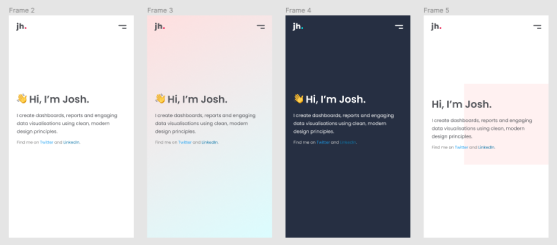
Once I had built out a version 1 of my site based on my initial Figma designs, Lighthouse testing flagged up some accessibility issues - some fonts being too small, and some fonts not having a sufficient contrast ratio.
Both were quick fixes, but I thought it was worth noting how important it is to test your website to ensure it’s accessible for all users. For example my projects cards section, which looked great in Figma to my eyes, needed to be re-coloured as shown below:
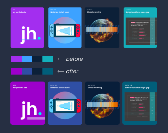
Project cards appearance before and after accessibility changes
Once these issues were taken care of, I tested the site again and was for the first time ever able to achieve perfect lighthouse scores! As someone who’s struggled through hours of trying to improve performance scores on a few wordpress sites, to come out at perfect 100’s across the board feels like a real achievement.
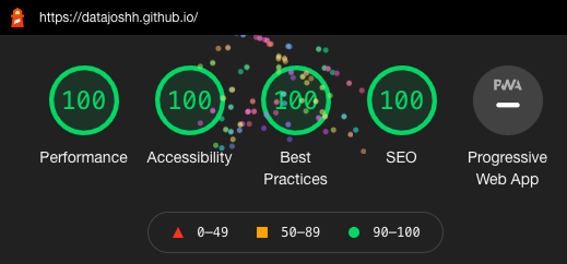
Results from Google Chrome's Lighthouse testing